
Link's Redesign in Zelda: Ocarina of Time Remake is Dividing Fans
A wave of backlash over character design proves that no version of Zelda's hero survives the internet unscathed.
News by Adeela Tas on Sep 13, 2026
A fresh wave of debate has broken out over Link's design in the upcoming Zelda: Ocarina of Time Remake, and this one is hitting a little different than the last. It's the second major dust-up in just a few days, and this time the target isn't Zelda's redesign; it's Link himself, and whether his new appearance fits the rest of the cast around him.
The criticism kicked off with someone describing their reaction to the first glimpse of the Zelda: Ocarina of Time Remake as genuine discomfort. According to their take, Link's more realistic design pulled him out of the whimsical, cartoonish world of Kokiri Forest and dropped him somewhere far less charming.
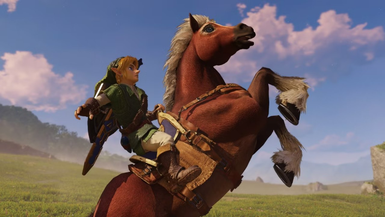
At first, you might assume that reaction was based on a fleeting shot or an early teaser, and that a longer look would soften the opinion. That's not what happened. After watching extended footage from Nintendo's recent Zelda anniversary presentation, the writer doubled down, insisting the character still felt off; even calling him unsettling to look at.
The specific complaint centers on texture and material more than facial structure.
Link, in this version of the Zelda: Ocarina of Time Remake, has been described as looking artificially smooth, almost plastic, especially in scenes involving water. That description alone might not raise many eyebrows, since character models reacting to wet environments can look strange in almost any game.
The report pushed further, comparing the visual style to something generated by an AI tool rather than an actual development studio, only backing off because everyone already knows Nintendo built this version of the Zelda: Ocarina of Time Remake in-house.
That AI comparison is where much of the online pushback has focused. It's become increasingly common for commentary about game visuals, movie effects, or even music production to get compared to AI output the moment something looks unfamiliar or slightly different from what people expect.
Whether or not you're a fan of AI tools in creative industries, tossing that label onto human-made character work just because it looks different is a stretch, and plenty of fans following the Zelda: Ocarina of Time Remake conversation have already pointed that out.
What makes the criticism stranger is how inconsistently it's applied.
The same commentary that called Link's design distracting had nothing but praise for nearly every other character shown in the same footage. Princess Ruto, one of the story's non-human allies, was called out specifically for looking great. The Great Fairy character received similar praise.
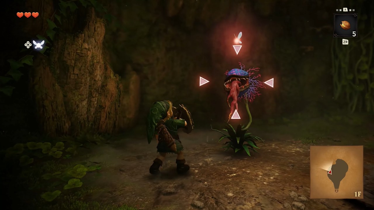
Even the monster designs were singled out as fitting exactly what people would expect from a modernized version of the game. So, according to this take, the issue isn't the overall art direction of Zelda: Ocarina of Time Remake; it's how detailed Link looks compared to everyone standing next to him.
That detail gap is presented as the core problem. The argument suggests that because Link has sharper, more realistic features than the stylized world and characters surrounding him, he looks out of place, almost like he wandered in from a different game entirely.
The comparison used is that it feels like he's been dropped into a setting that doesn't match his own design, while everyone else got to stay comfortably cartoonish. Even his adult form, which usually gets some of the more serious visual treatment in Zelda titles, is described as easier to look at than his child version in this particular Zelda: Ocarina of Time Remake.
It's worth remembering this isn't the first time a Zelda title has caused this kind of visual argument.
Long before the current controversy, the cel-shaded, brightly colored art direction of an earlier Zelda game caused an uproar among fans who wanted a more traditional, realistic look. Years later, an entirely different Zelda entry got criticized for going too dark and muted, with players joking that the whole game looked like it had been dipped in soot.
So the idea that a new Zelda project stirs strong reactions to its visuals isn't new; it happens almost every time the franchise reveals a fresh art style, and the Zelda: Ocarina of Time Remake was always next in line for that same debate. The discussion also raises a broader point that shows up fairly often in game design conversations: chasing photorealism can make a game feel dated faster than a stylized approach.
That's an interesting angle, especially given that the original Ocarina of Time was built decades ago under serious hardware limitations, yet still holds up as a beloved, technically impressive game for its time. The suggestion is that Nintendo, with the Zelda: Ocarina of Time Remake, is now chasing a different kind of realism, one meant to compete visually with other big-budget, hyper-detailed titles hitting the market around the same time.
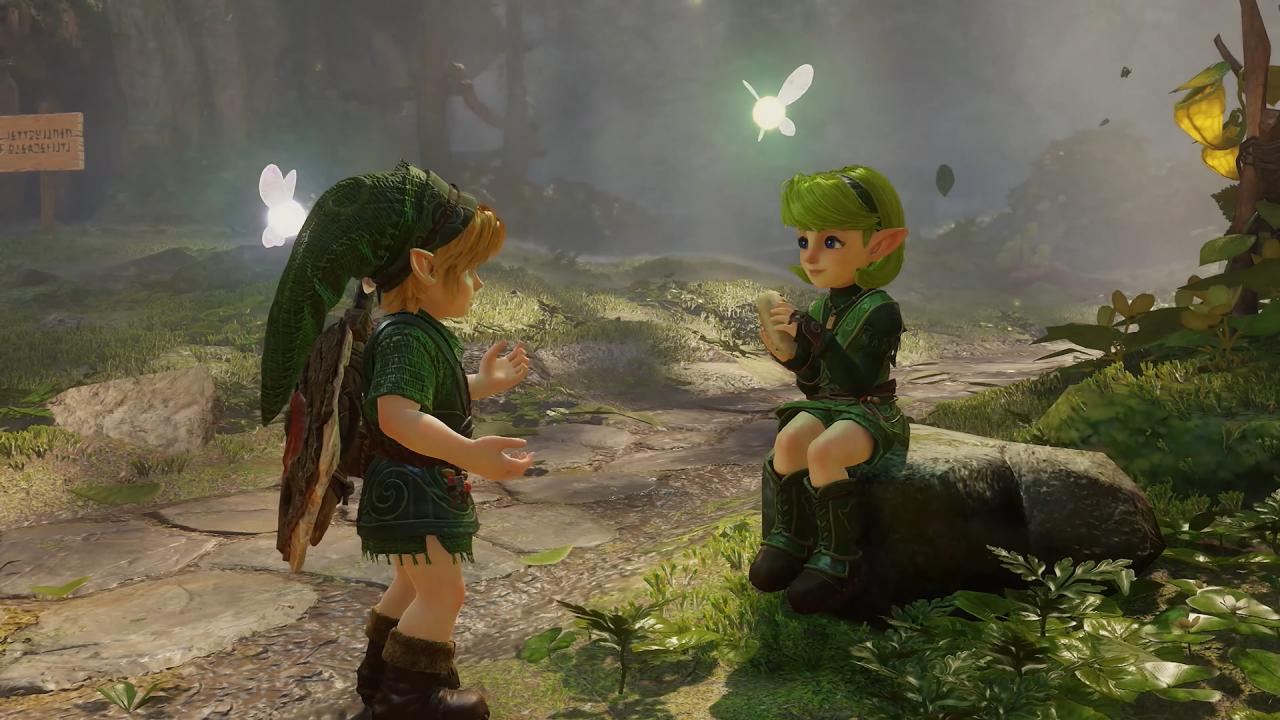
But that comparison doesn't quite land for many viewers either. Looking at the actual screenshots and trailer footage from the Zelda: Ocarina of Time Remake, it's hard to draw a straight line between Link's design and the ultra-realistic, gritty visuals typically associated with major open-world or action titles.
If anything, the overall tone feels closer to a more painterly, semi-realistic fantasy style, not the hyper-detailed realism the criticism implies. Fans will keep debating whether that comparison holds up as more footage rolls out. What stands out most, though, is how thin the actual argument turns out to be once you strip away the dramatic language.
The complaint boils down to Link having more visual detail than the world and characters around him.
This is paired with a passing guess that the extra detail resembles AI-generated art. There's no real breakdown of his facial features, proportions, or animation quality; just a general sense of discomfort explained through comparison rather than specifics. For an argument built around calling a character's appearance disturbing, that's a surprisingly shallow foundation.
It also raises a fair question about motivation. Traffic and engagement drive a lot of gaming coverage right now, and headlines built around outrage tend to perform better than balanced takes. That doesn't necessarily mean the reaction wasn't genuine, but it does explain why so many outlets seem eager to frame small design choices as major controversies the moment a new trailer drops.
The Zelda: Ocarina of Time Remake was always going to be scrutinized closely, given how beloved the original is, but turning a subjective preference into a headline calling a character a "freak" crosses from critique into something closer to mockery.
At the end of the day, opinions on character design will always be personal. Some players will prefer the more detailed look Link has in this version of the Zelda: Ocarina of Time Remake, while others will feel more connected to the simpler, blockier design from the original N64 release.
.jpg)
That kind of disagreement is normal, and it's part of what makes revisiting a classic game so interesting in the first place.
But there's a difference between explaining why a design doesn't work for you and dismissing it with insults dressed up as commentary. The strongest arguments about the Zelda: Ocarina of Time Remake so far haven't come from viral headlines; they've come from fans breaking down specific details, comparing screenshots, and having actual conversations about what works and what doesn't.
Until more gameplay and character reveals drop, the debate over Link's appearance in the Zelda: Ocarina of Time Remake is likely to keep simmering. And given how divisive Zelda's art direction has been in the past, this almost certainly won't be the last time a design choice sparks this much conversation before the game even releases.
Editor, NoobFeed
Related News
No Data.